“We are ready to question the impersonality of a merely technical approach to data and to begin designing ways to connect numbers to what they really stand for: knowledge, behaviours, people.”
~ Giorgia Lupi
We believe data should be accessible and empowering for everybody. Data can be a powerful tool for people, enabling them to enrich their lives, broaden their view on society and learn from each other. The quote from Giorgia Lupi you see above was one of our main inspiration sources. You can read her whole manifesto here.
We are very much inspired by the work of our collaborating partner Kontinentalist, a design studio that creates data stories from an Asian perspective. Their approach is to gap misconceptions about Asia by representing cultural experiences with data visualization. Have a look at their work and a talk they gave about their way of working during the Outliers Conference last year.
Another community we feel close to is the Data Visualisation Society, a worldwide organization that strives for the representation of all cultures and people in data visualization and fosters an inclusive, diverse and international society. They host an excellent blog on data vis, called Nightingale.
Some inspiring work to give you an idea what (cross-)cultural data stories and data visualisation from a humanistic angle could look like:
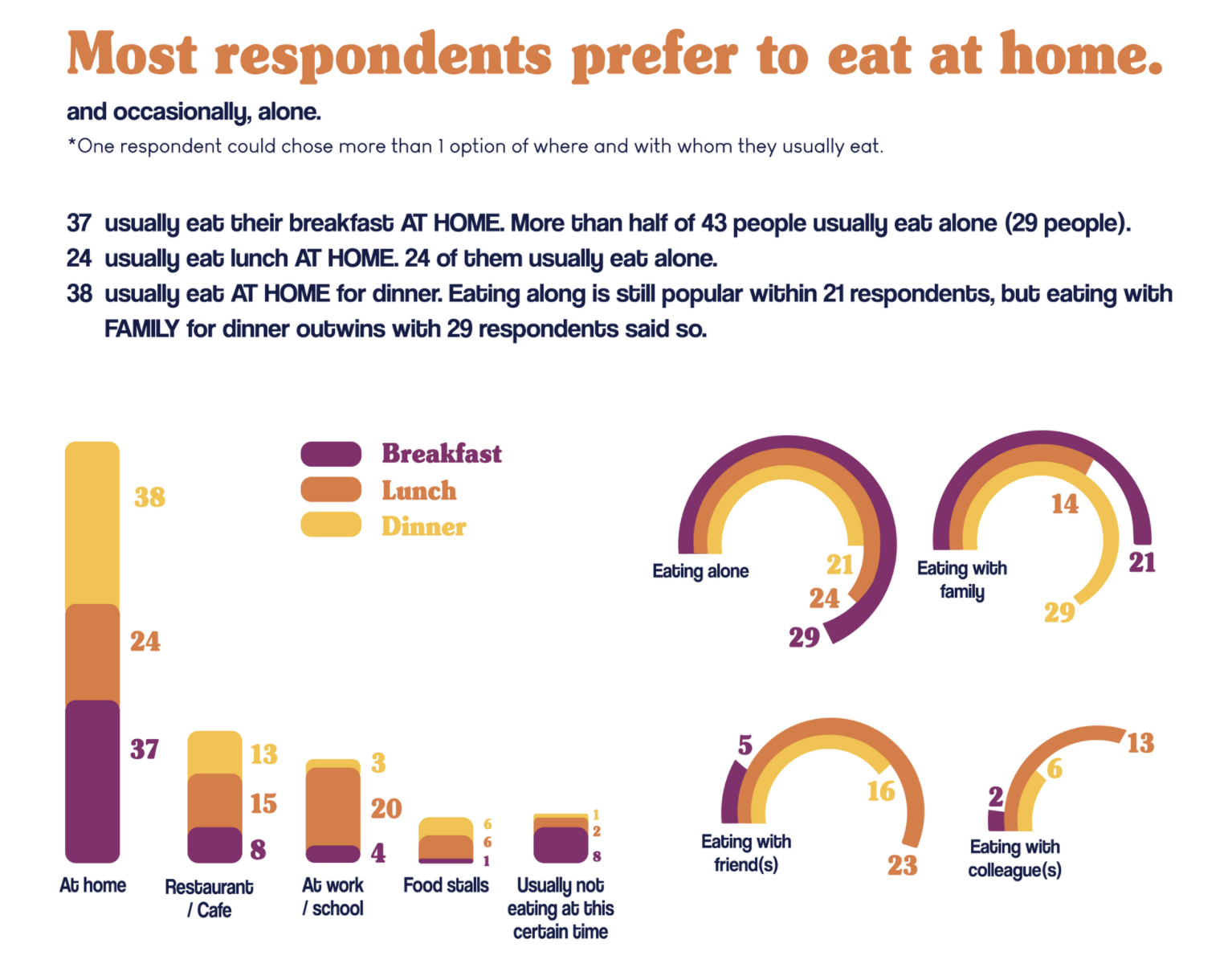
During the CCDL project we ran in the spring of 2021, student Fikha Adelia from Indonesia made a wonderful data story about food habits around the world:
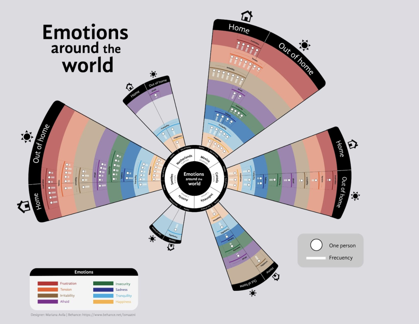
CCDL-Students Alenka from Sweden and Mariana Avila from Mexico visualized the feelings people reported to have during COVID-lockdowns in different countries:
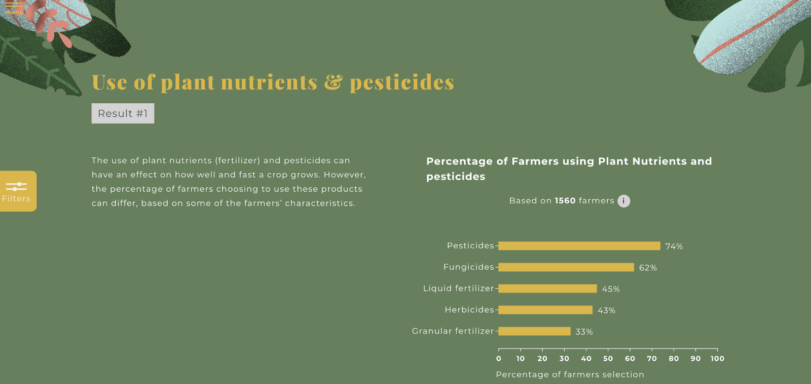
This website was developed by a team of students in Amsterdam from the Data Visualisation program at the AUAS. It allows the end-user to explore data about the life circumstances of Cocoa farmers in Ghana:
Some examples of data visualizations about cultural experiences:
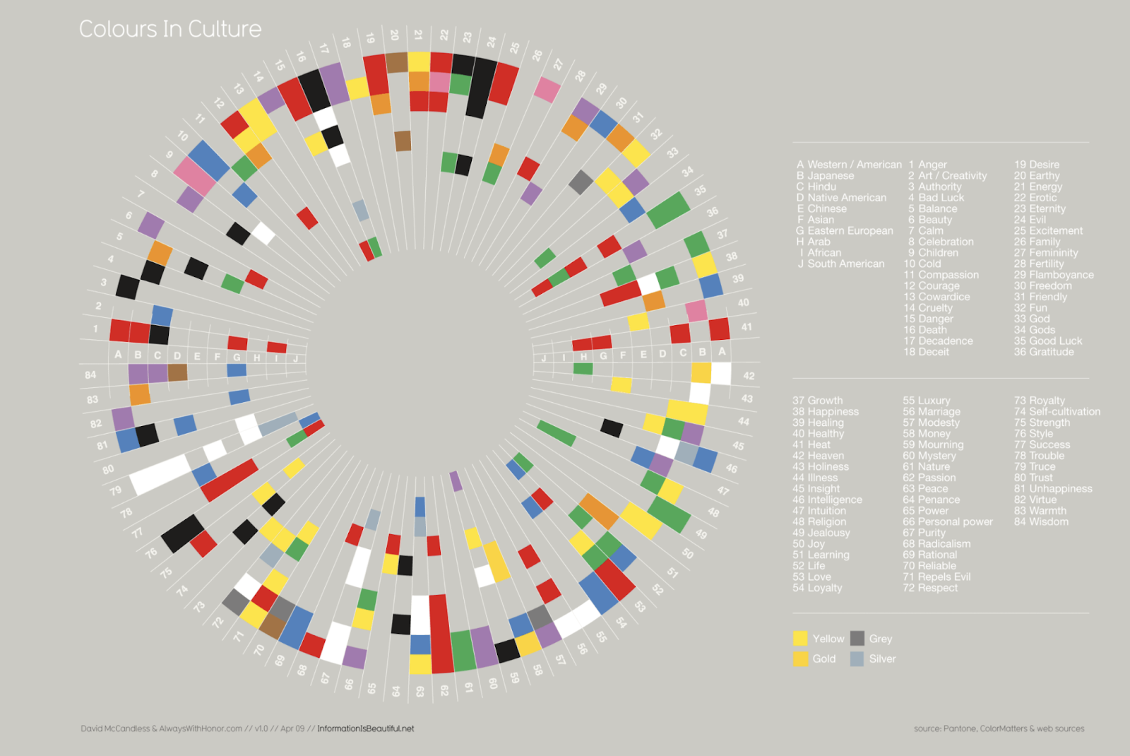
A beautiful data vis of the cultural experience of color by information designer David McCandless that is still so inspiring:
As mentioned before, the work of Kontinentalist is a great example of what cultural data stories can look like, like this story about the perception of global warming.
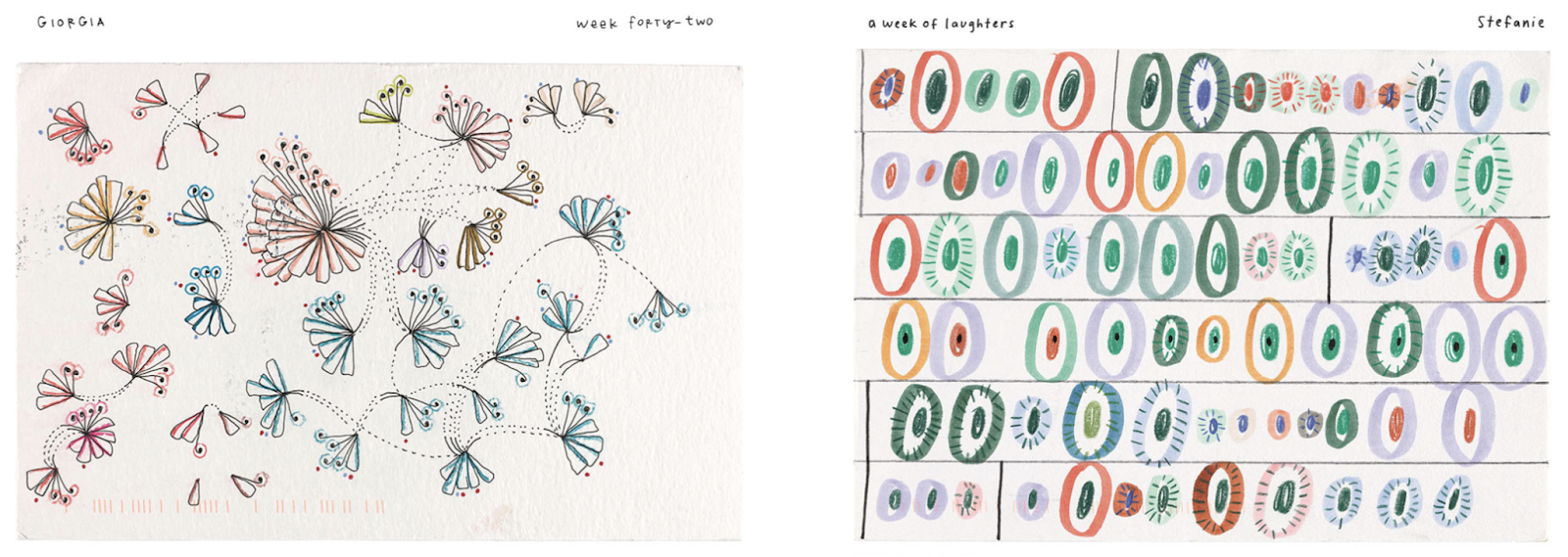
The project Dear Data by information designers Stefanie Posavek and Giorgia Lupi shows a personal and humanistic approach to datavis by collecting data from your own environment.
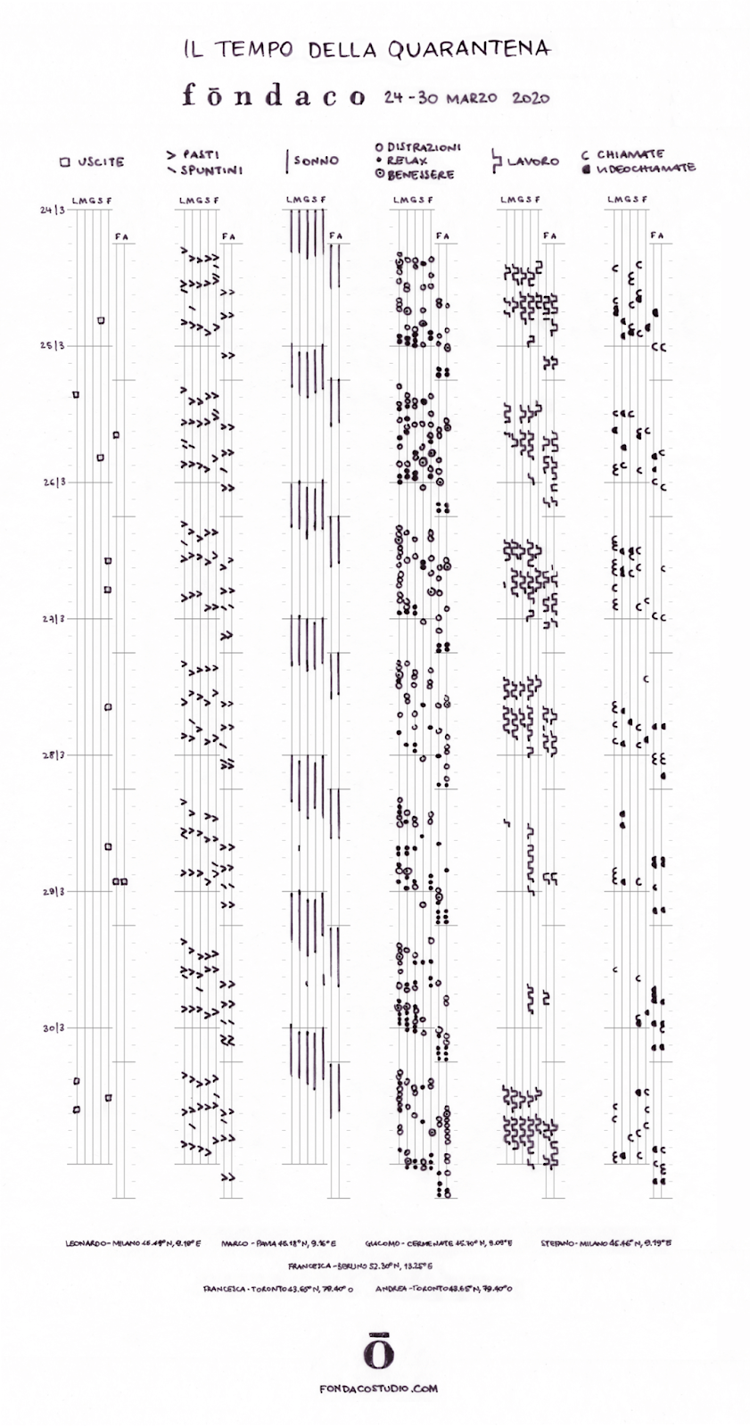
The ‘Time of Quarantine’ by Andrea Giambelli combines personal data about the experience of Covid lock-downs in 7 different countries.