Hello and welcome!
Welcome to the Cross-Cultural Data Visualization project pages 🙂
This is the link to our MS Teams community, in which we will collaborate during the projects:
https://teams.microsoft.com/l/meetup-join/19%3aN-ukAfrB6fFjgpEoxu5bqsiDhtuidQDg3uFb2X8am5U1%40thread.tacv2/1644503809710?context=%7b%22Tid%22%3a%220907bb1e-21fc-476f-8843-02d09ceb59a7%22%2c%22Oid%22%3a%2292444d8b-45af-4c84-99fd-9ce7d95768ba%22%7d
On the Miro board you can see the work that’s made in the kick-off week: https://miro.com/app/board/uXjVOPWlBKU=/?invite_link_id=858666978229
No stress
If you didn’t manage to get in contact with other participants this week or didn’t get access to the CCDV Team in MS Teams, don’t worry! The official program starts on Monday 28, so we have two more weeks to work out the communication in MS Teams, introduce ourselves and prepare.
Introductions
If you did manage to access the CCDV team in MS Teams, could you please introduce yourself in the Introductions Channel?
Data Walking
In the meantime, If you want to learn more about data visualisation and collection, you can do some Datawalking. Design teacher David Hunter from London gave a real fun workshop you can watch, and carry out as a Data walk: https://www.youtube.com/embed/snUIFBvCygA?start=822&feature=oembed
You can find the slides and tools from David’s presentation here:
https://datawalking.com/
https://datawalking.com/workshop.html
Here are the results of the Datawalking workshop with David Hunter from Ravensbourne University in London.
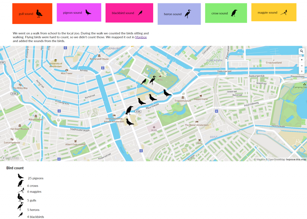
Amsterdam // Birds and their sounds – by Noa and Lisanne
Noah and Lisanne went on a walk from school to the local Zoo. They counted the birds sitting and walking. Flying birds were too hard to count. Check out the interactive map they made that includes sound: https://oege.ie.hva.nl/~wennemn/map/ Map is made with Mapbox.
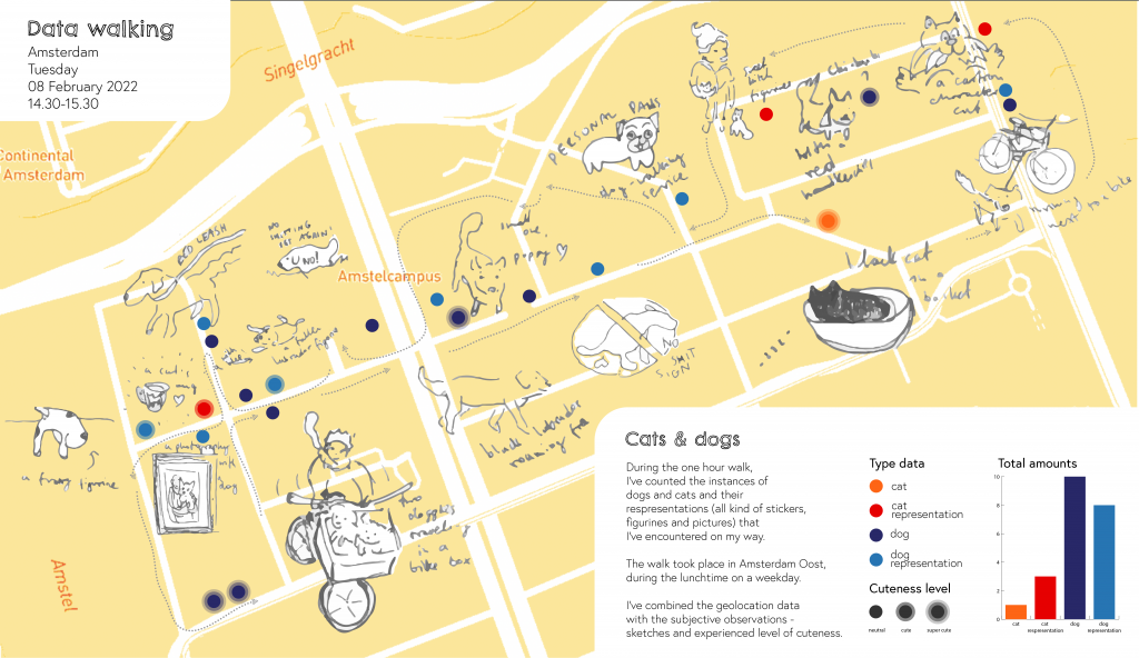
Amsterdam // Cats and Dogs – by Aleksandra
Aleksandra counted the instances of cats and dogs, including graphical representations (stickers, sings, etc..). She made hand drwaing on the spot that are included in the end result. Map is made with Mapbox.
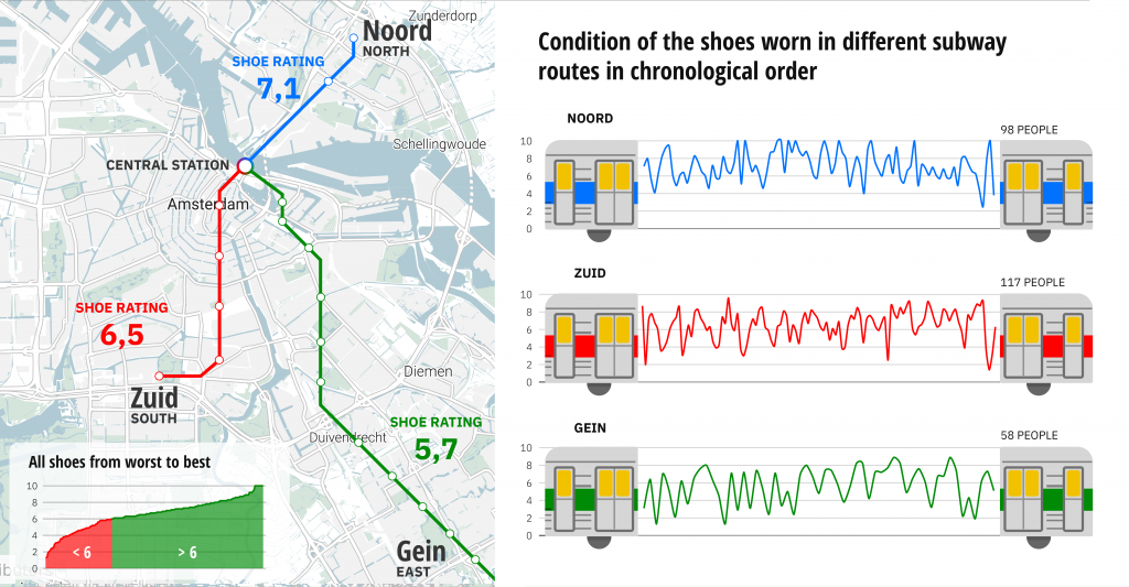
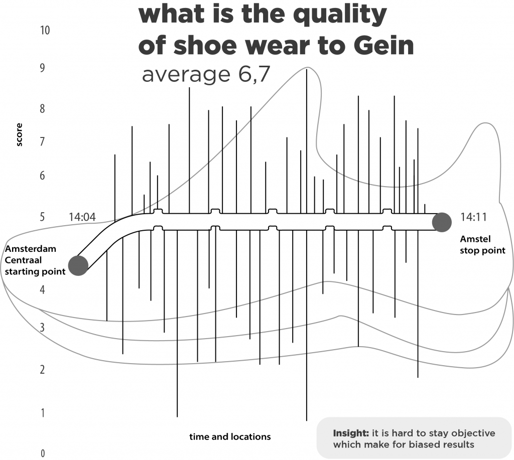
Amsterdam // Shoe quality – by Jeffrey, Simon and Floris
These visualisation show the quality of shoes, worn by passengers on three different subway lines. The data were captured by walking through the subway car, logging the shoes and the quality of it.
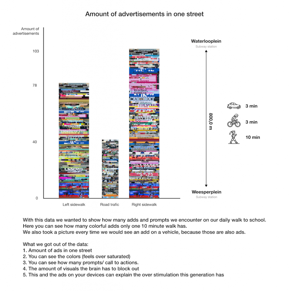
Amsterdam // Advertisements – by Maika and Dennis
Maika and Dennis wanted to show how many adds and prompts they encounter on a daily 10 minute walk to school.
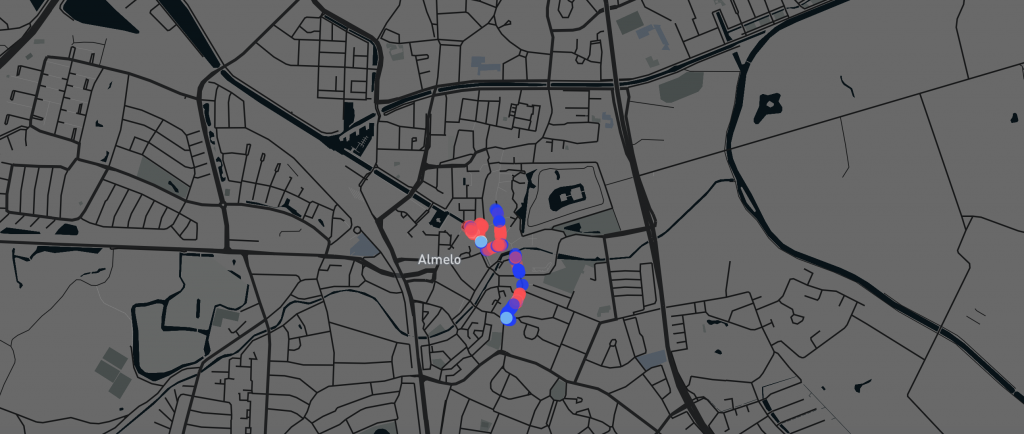
Almelo // Mannequins- by Stijn
Stijn gathered information on the gender and age of mannequins in front of store shop windows. The research led to the conclusion that clothing stores in Almelo are clustered based on gender and that men have more specialized stores (suits) and women more everyday stores. Check out the zoomable map, made with Mapbox.